[How-to] Adding a "Reduced Effect Intensity" option to an existing RPG Maker MV game
This article is a detailed breakdown of why and how we implemented the accessibility options that were added to Nina Aquila: Legal Eagle in December 2020. Much of this info would be useful for any indie developer, but we hope that it will be particularly useful for other users of RPG Maker MV and similar packages.
NOTE: There are some illustrative images later in this article, but no videos or animated GIFS, so there are no flashing images.
When it comes to videogames, Accessibility is a topic with an uneven history.
Progress has been made in some areas. We’re seeing some platform holders embrace highly configurable controllers, specialised control schemes, and the inspiring work of charities such as Special Effect, to name just one.
Despite that, even very large developers have been known to ship high profile games with all manner of expensive features and enormous ad budgets, that don’t even have subtitles for all their dialogue.
Then there are the widely publicised poor examples, such as that game which added a colour-blindness option that just simulated colour-blindness.
For indie developers, which are often a 1-person “team”, or a very small team, these issues are exacerbated. We’re forced to pick and choose our battles. Features & content go on a backlog, and wait silently until "the right time” to address them.
I’m writing here as a person who has had to sell-on the occasional game that they couldn’t play, purely due to an accessibility oversight, so I can tell you that unfortunately, sometimes “the right time” never comes.
Despite that, I think, if 2020 has taught anything to us in the game industry (apart from how crazy-rich Citrix must be at this point), it’s that if we can make modest changes to significantly broaden a game’s accessibility, then we really, really should.

Back in 2019, a player mentioned something to us - that they enjoyed Nina Aquila: Legal Eagle, but they had to struggle through it a bit because the game has many flashes and some strobing VFX; this user was a person who was atypically photosensitive. They asked if we could fix it. At the time, we had to “backlog the task”, as NALE’s flashes couldn’t just be “turned off”; some of them are used to cover up sins in cutscenes and various bits-and-pieces, meaning it would require not-insignificant changes to the game.
Still, it was something we wanted to do, and, when the release of Cyberpunk 2077 was on the horizon and complaints started to filter through about its effect on photosensitive players, we had only recently completed Chapter 3, and decided to investigate this.
Before we started
Prior to this, we had already considered some aspects of accessibility when first designing NALE, namely...
- No dexterity requirement - NALE would never require twitch skill, and any battle mechanics would be turn-based. Users with limited dexterity or coordination would not struggle to play NALE.
- No colour-perception mechanics - NALE would never require the user to possess good colour-perception to succeed. All evidence, UI, clues, hints... Everything would use both form and shape, with colour as a secondary differentiator.
- No difficulty barring - NALE’s battle modes would always have an option that users can enable which makes them impossible to lose. The difficulty of these battle modes would never bar a user from progressing unless they wish to be challenged. Neither way in-game is presented as “correct”, e.g. the “no-lose mode” is never referred to as something like “easy mode”.
- Reduced audio volume defaults - This is an RPGMaker MV-specific thing; the engine defaults with game audio being set to 100%, which is incredibly loud. Right from launch we used a Olivia’s anti-player-stress plugin to default to 60%, which is a much better value for everyone, not just audio-sensitive persons.
The intent for NALE is that everyone who starts a chapter will see the end, so we tried, from the beginning of the project, to remember the above principles.
Despite those good intentions, the game did possess some elements that caused significant accessibility problems for some of our users. The main problems we faced were with intense VFX that can cause discomfort for users who are photosensitive, and a moving battle camera that can cause problems for users who can experience motion sickness.
Our aims
Our (very naïve) aims were to release new builds of NALE Chapter 1, 2 and 3, in all channels, that would address the following:
- Make the game playable for users that are photosensitive
- Make the battle sequences move less, and be easier for users with motion sickness
- Make the game “safe” for users with photosensitive epilepsy*
*this is what I meant when I said “naïve”. Going into this task, we readily admit that we had only a rudimentary understanding of photosensitive conditions such as epilepsy.
Now, with the work complete, we can still say we only have a rudimentary understanding of photosensitive conditions - but the difference is that we KNOW we only have a rudimentary understanding (progress!).
Next Steps
At this point, we were very fortunate to meet @IndieGamerChick on Twitter, who has done a great deal to raise awareness of issues close to people with photosensitive conditions when it comes to videogames. We had a short discussion on this topic, where they outlined some primer knowledge in this area, along with linking this video by @LaurakBuzz, which was enormously helpful:
The image most people have of “photosensitive epilepsy” - as in, a person exposed to flashing images experiencing a convulsive seizure - isn’t wrong, but it’s reductive.
Firstly, the word photosensitive; all humans who aren’t blind are photosensitive to some degree. To borrow Laura’s example, if you’re trapped in a room with a strobe light and have no way to turn it off, it will first become annoying, and soon cause actual, physical pain. We can all identify with this.
Even with those who have clinical photosensitivity, i.e. those users who have a recognised condition, the patterns and behaviours of light that trigger their condition can be enormously varied, even if there’s the perception that bright, flashing or strobing patterns are more common.
Epilepsy too is an incredibly broad condition, with a wide range of triggers & effects. For instance, when some people experience a seizure, it manifests in different ways, such as affecting their mood, or making them unresponsive, not the convulsive reaction that is more the stereotype.
So what does this mean for a game?
Laura’s advice, which we followed, is simply this - do not label your game as having an “epilepsy mode”, for multiple reasons:
- It's pragmatically impossible to cover the wide range of forms of epilepsy
- Not all clinically photosensitive persons even have epilepsy
- Some people who are not clinically photosensitive may wish to use your options anyway
Instead, follow these these steps:
- Give your game’s mode a more neutral, non-clinical name, such as “Reduced Effect Intensity”
- Provide information about what this option does
- Put detailed information somewhere easily accessible online
- Use terms such as “may” instead of “will” in your explanations when saying the game may reduce photosensitive discomfort
- Add a disclaimer which makes it clear that while you hope the game will be more usable to some users, that this doesn’t constitute a medical sign-off and that they should still exercise caution
The Problems
Our revised aim was to make a mode with reduced visual intensity. That meant addressing the following issues, which we expect are probably shared by other RPG Maker developers:
- “Screen Flashes”, used in battles and for VFX like lightning, can cause discomfort
- “Screen Shakes” can cause motion sickness
- Bright VFX battle animations cause discomfort
- Battle transitions contain bright flashes
- “Reduced Effect Intensity” changes - Fade-to-white transitions and between scenes and map VFX could be very bright, and cause some visual discomfort
- The roving camera in battles, if moving excessively, could cause motion sickness
- We needed to add additional functionality to the game’s options screen to control these changes
Some of these issues were easy to resolve, some of them less so. Below, we talk about each one in turn, and how we went about resolving it. This part will be of greatest interest to others who use RPG Maker MV.
Screen Flashes & Shakes
“True” screen flashes & shakes were the first thing we investigated, because we suspected this would be quite easy. This encompasses all flashes & shakes that use MV’s specific commands:
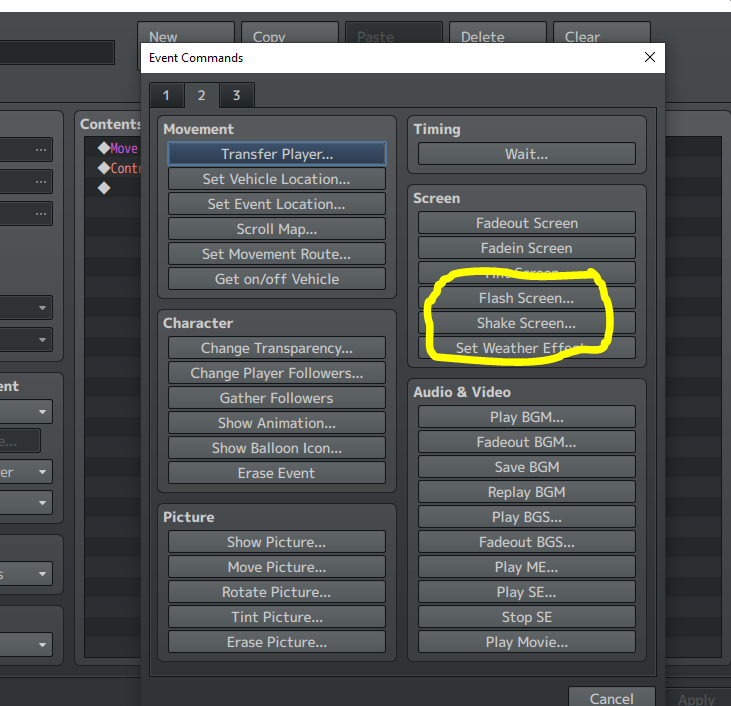
First, we reviewed all three chapters of NALE to see if any of the flashes were important to the plot or gameplay, and while there were many instances of these in the game, we only found 2 places where turning them off caused issues. For these, we would later rework the dialogue (see “Reduced Effect Intensity”) below, and for the rest, simply turning the effects OFF would not cause problems.
We assumed someone had already solved this problem, and we were correct - user BLUEBOOTH on the RPGMaker Forums had already looked into this, creating a plugin that neutralised all screen flashes.
With a bit of our own scripting, we were able to adapt this to do the same thing for Shakes, and we sent our adapted plugin back to BLUEBOOTH for them to distribute.
Another nice thing about these plugins is that they provided a flag on the game’s options screen where users can enable/disable the effect:
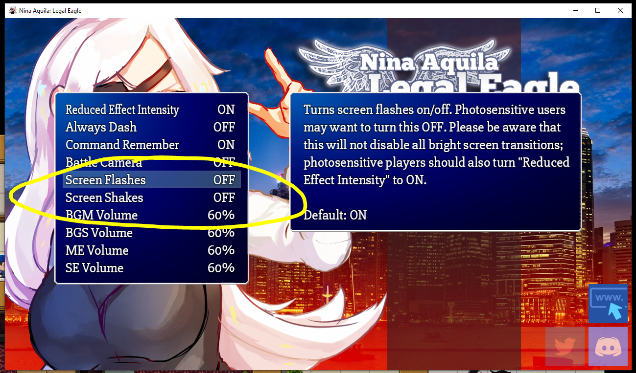
Additionally, you can access these options from within in-game scripts using a structure similar to the conditional statement below:
This allows you to either run an IF statement to check if the effect is on/off (this will be useful later) or even set the value. Just remember, if you set the value using in-game events, you will also need to call this:
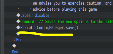
This saves the current options; otherwise if you quit and reload the game, the option you’ve changed will not have saved.
This part, in whole, was really quite fast and fixed a huge number of flashes and shakes present in the game.
Bright VFX in battles
Our next step was to look at animations & battle VFX, as many of these FX were very bright.
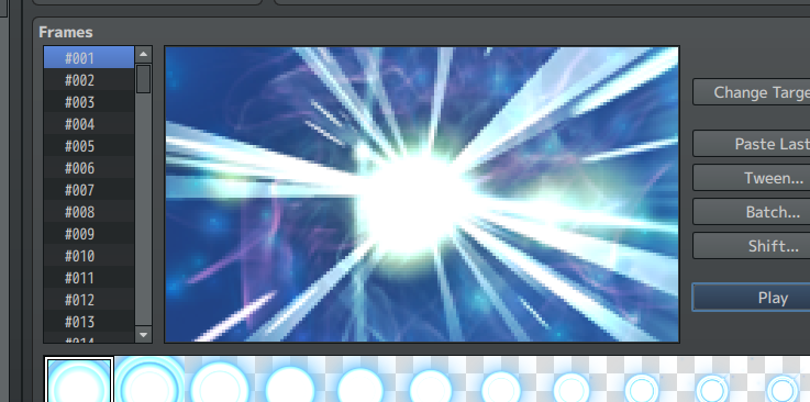
We looked at various approaches, and soon realised that the best way to do this would be to have two VFX for every flashy effect; a regular version and an Reduced Effect Intensity/REI version. However, we had no means to swap these effects in/out on-the-fly.
We turned to the RPG Maker boards for a solution for this, and want to take this moment to thank Caethyril, who provided us a wonderful plugin; this plugin contains a list of animations, where we can specify the regular animation, alongside an REI animation we would like to serve as its substitute.
It also references a switch (RPGMMV’s name for a global bool), so we can turn the behaviour on/off depending on if the user has the REI mode turned off (the regular anims) or on (the REI anims).
Once we had the tools, we worked through our anims and changed all of them. Generally, the REI anims differ in the following ways:
- All whole-screen flashes were removed
- Most sprite-flashes were removed, some where significantly toned down
- All strobing FX were removed
- All assets that had strong contrast in their FX were toned down
- Some animations were replaced by much simpler anims with fewer moving/flashing elements
This took a little while, as we wanted to make sure that the revised anims, while being less “noisy”, communicated the same information and provided a comparable experience to the originals.
Additionally, some of these anims are used outside of battles, so these also required testing to make sure their new versions worked in situ.
Removing battle transition flashes
RPG Maker MV employs a battle transition with a number of bright white flashes, which can cause visual discomfort. We've actually always disliked this effect, irrespective of accessibility concerns, and decided just to remove these flashes altogether.
There are various plugins to control battle transitions; we went with SRDude's plugin, because we've used their plugins in other aspects of our game.
Reduced Effect Intensity
The above changes fix a huge number of areas across the game in one fell swoop, but there were still many areas of NALE causing problems due to intense FX. These were mostly due to the use of the “screen tint” command, which allows you to place a coloured layer over the screen; e.g. you can make the screen blue-er for night-time scenes.
We were also using the tints for many other purposes, including...
- Coloured/white scene transitions for variety
- “long” flashes, for dramatic effect
- strong changes of scene colour for things like characters experiencing nightmares
Collectively, once we’d audited the game, we found somewhere in the region of 45 different places where we would need to make changes.
Unfortunately there was no “easy way” for this one. We defined a global switch as “Reduced Effect Intensity”, and had to put in IF statements throughout the game. If it was OFF, we used the regular approach, if it was ON, we used a new REI version.
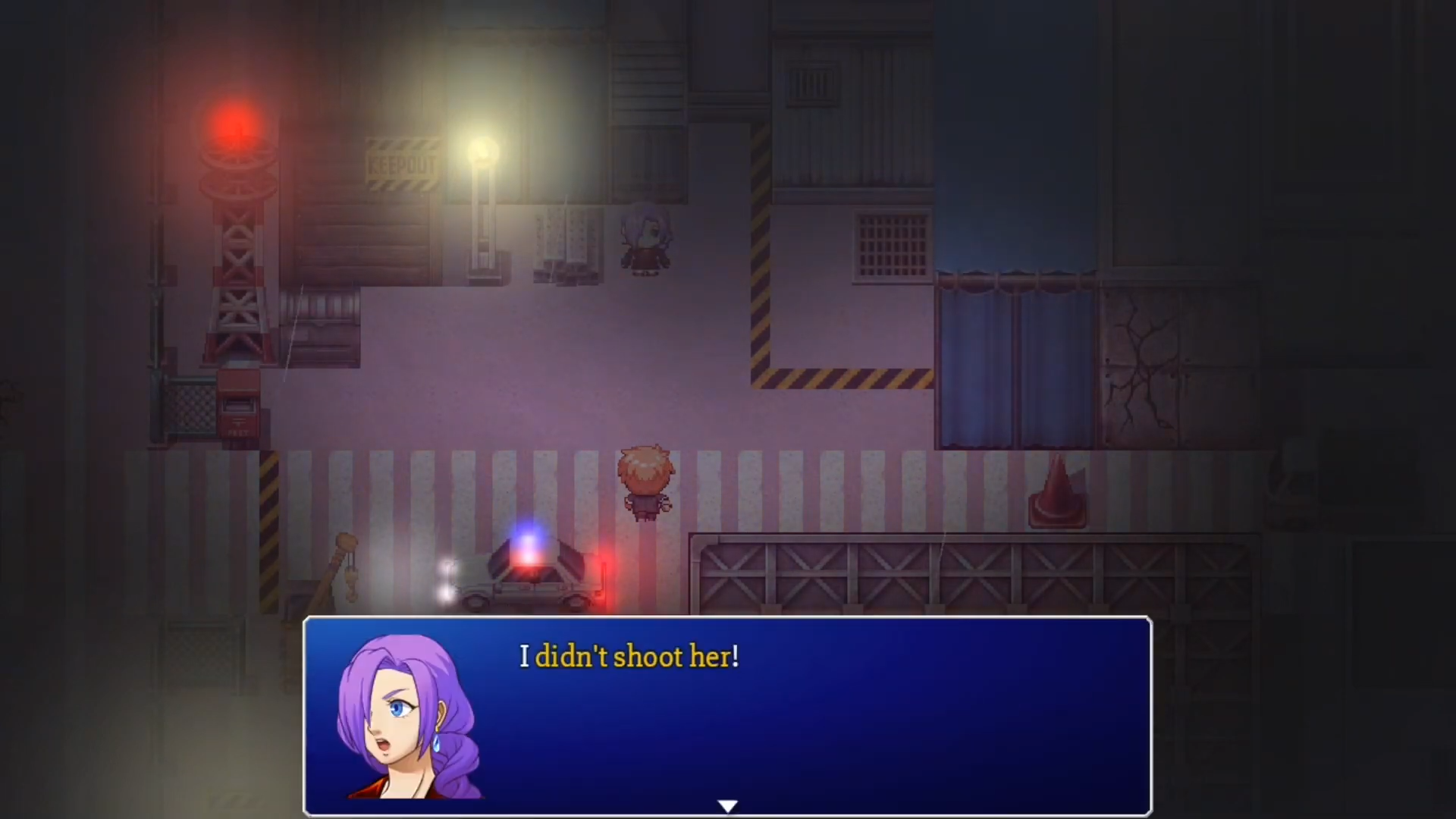
This scene from Chapter 1 usually uses an oscillating red/blue effect, due to the lights on top of the police car. With the REI switch turned ON, this sequence now just has a static soft red glow.
Typically, we softened or removed any flashes, changed white transitions to darker colours (and usually made them longer), and even modified some cutscenes.
In some cases this was just because cutscenes using the new approach had different pacing, and we wanted players using the REI mode to get a different-but-equivalent experience. In others characters sometimes say lines like “What was that bright flash?” in the dialogue; in these scenarios we rewrote that part of the cutscene entirely; fortunately there were only 3-4 instances where we had to do this.
That being said, none of this was difficult; the most time consuming part was testing every single change with the switch both OFF and ON, to be sure we hadn’t introduced any bugs.
Roving Battle Camera
The Roving Battle Camera required two solutions, because NALE’s chapters actually have two mutually exclusive battle systems - the card battles in Chapter 2 and the race battles in Chapter 3.
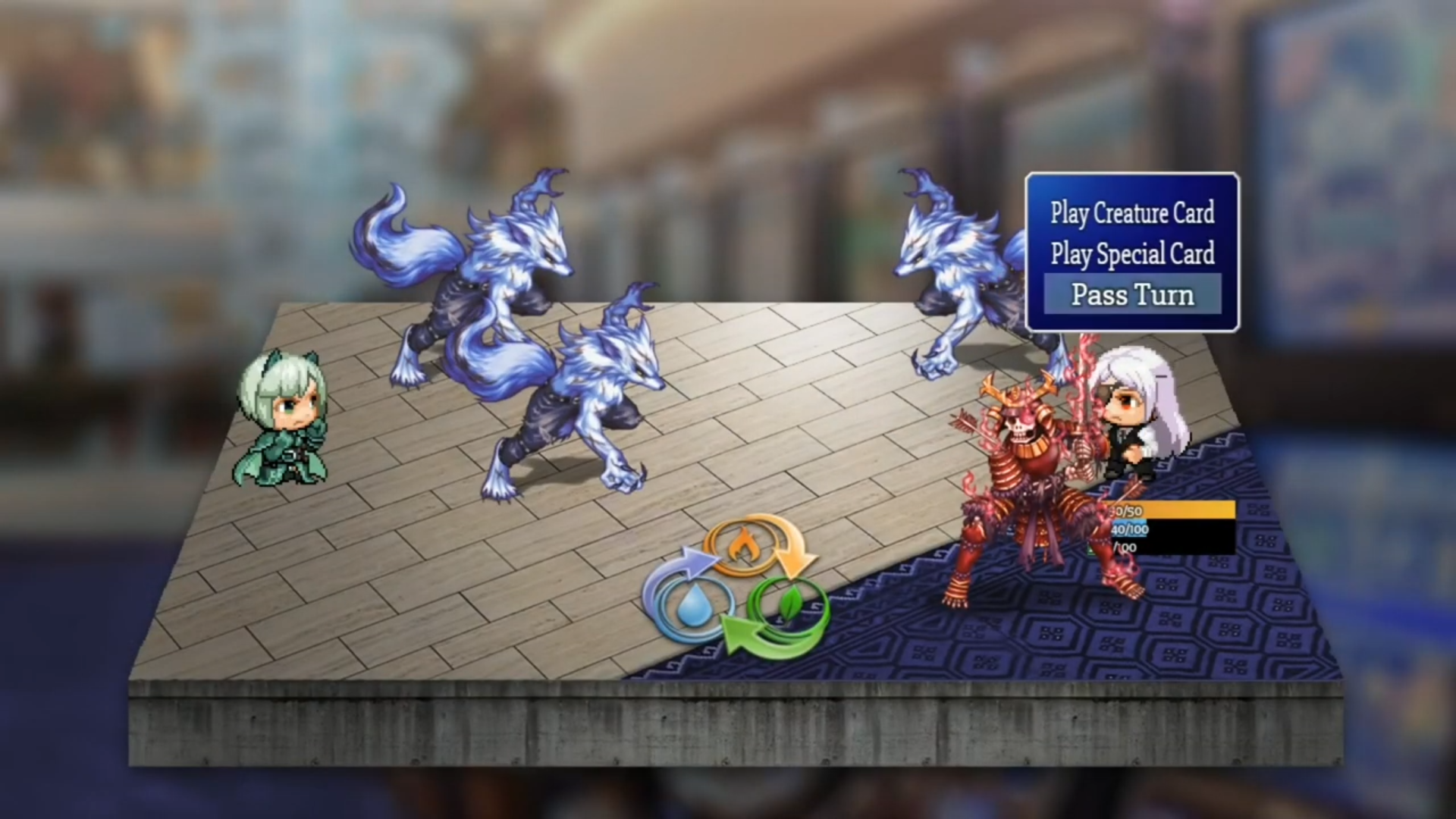
Chapter 2′s card battles were the easiest, those battles hooked into RPGM’s default battle system, and because the engine already has an option to turn those off.
However, the race battles of Chapter 3 were a different story.
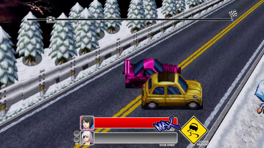
This goes back to those script calls we mentioned earlier; we were able to use these to detect if the user had turned the camera option OFF, and if they had, we used IF statements to manually disable all camera movements save for the ones that are most necessary for the mode; so all the purely cosmetic camera movement has been stablised.
It should be said at this point that NALE’s regular cutscenes have a very active, roving camera; unfortunately we couldn’t disable this, as that would require we rescripted most of the game (if you turned it off, you’d see many things that are kept “waiting in the wings”, just off the edges of the screen). This is something we want to keep in mind for future titles.
Making the option selectable
We were left with one last problem - how to make the option selectable, and to inform the user about what it does.
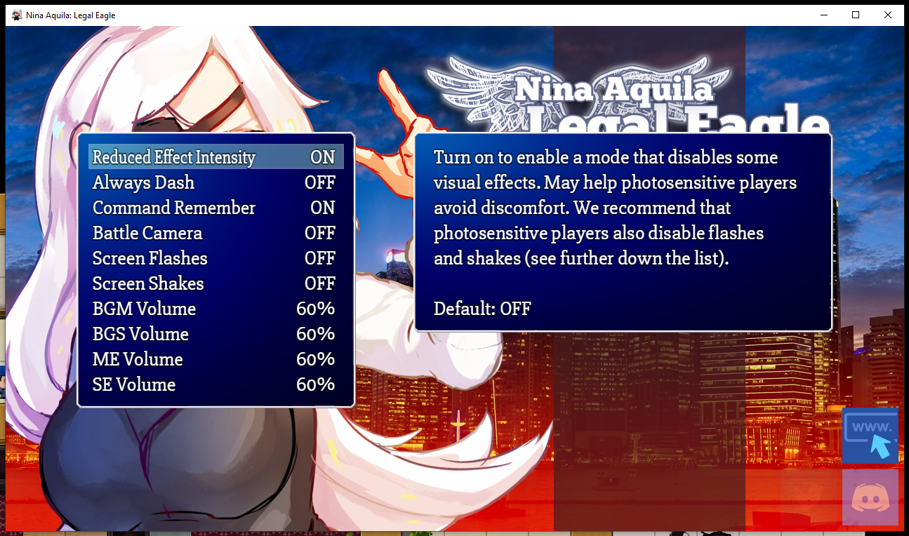
We were able to do this with DreamX’s options plugin, which allowed us to have a menu option that controls an in-game switch. It also allows for customisation of the options screen, putting in a window with a description of each option:

Additionally, having this flag allowed us to put in a short segment when first starting the game which helps guide the user in the use of these options.
Once this was complete, we were able to deploy new versions of all three NALE chapters with these changes.
A last-minute hiccup
Unfortunately, game development is never quite smooth sailing, and at the very last moment we ran into a problem with the browser-based version of NALE Chapter 1:
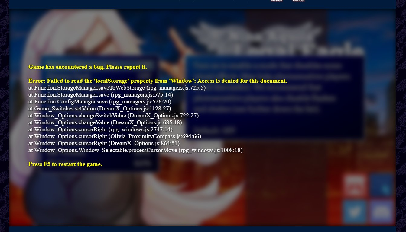
Namely that when under typical browser security settings, RPG Maker Games throw up an error when you try to save their options. This was a huge problem, and for a day, it looked like we were just going to have to drop the options in the web version altogether (even changing them via eventing/script would throw up a similar error, as RPGM always wants to save the changes).
Fortunately, Caethyril on the forums came through with the solution again. This plugin, when turned on, removes the error; the options still don’t save so if the user refreshes the page, they return to defaults, but as NALE Chapter 1 is a once-and-done experience, this is probably okay for most users - and users who do want to be able to save the options can always download the game, and run the desktop version.
This is only needed as part of the process for a browser-based game; if your game is download-only, you can skip this.
The result
All three chapters were updated with the new options on Wednesday, December 15th 2020.
- Chapter 1's newest version can be found HERE
- Chapter 2's newest version can be found HERE
- Chapter 3's newest version can be found HERE
- A detailed breakdown of the changes can be found HERE
While this isn't the end of the road for accessibility, we’re hoping that this will help some of those users who have spoken to us in the past about the game’s VFX being too intense.
If you take anything away from this, for RPGM developers in particular, this wasn’t difficult, just time-consuming. With the resources below, anyone should be able to implement this into their game in a matter of days/weeks, unless you’ve made a title which specifically hinges on certain VFX (then I imagine things would be trickier).
Thanks
This was only possible with information and help provided from various parts of the community.
Huge thanks to @IndieGamerChick and @LaurakBuzz.
Additionally, thanks to the creators of the resources below:
Resources
- Olivia’s anti-stress plugin, to default audio volume to 60%
- Bluebooth’s plugins page, to nullify screen shakes & screen flashes
- Caethyril’s anim replacer, to swap out animations on-the-fly
- SRDude's plugin to customise battle transitions
- DreamX’s options plugin to add the options to the menu
- Caethyril’s plugin to prevent an error with the game’s web version (optional)
Get Nina Aquila: Legal Eagle, Season One
Nina Aquila: Legal Eagle, Season One
Fight for justice in a world where all anime genres exist at once!
| Status | Released |
| Author | Tanuki-sama Studios |
| Genre | Visual Novel, Adventure, Interactive Fiction |
| Tags | 2D, Anime, Female Protagonist, graphic-adventure, Mystery, RPG Maker, Story Rich |
| Languages | English |
| Accessibility | Subtitles, Interactive tutorial |
More posts
- Help me replace my office chair :(Nov 22, 2023
- Things are about to get magical.Sep 14, 2022
- Something's coming.Sep 12, 2022
- Free Anniversary Wallpapers for fans!May 27, 2022
- Crowdfunded art reveal!Mar 24, 2022
- Check out this full preview of our new Key Art image!Feb 22, 2022
- Our goal is 90% funded!Feb 21, 2022
- We're nearly 60% funded!Feb 19, 2022
- Creator Day Sale!Feb 18, 2022
- We need your help!Feb 18, 2022

Leave a comment
Log in with itch.io to leave a comment.